
Saba Sohail
Tue May 20 2025
8 mins Read
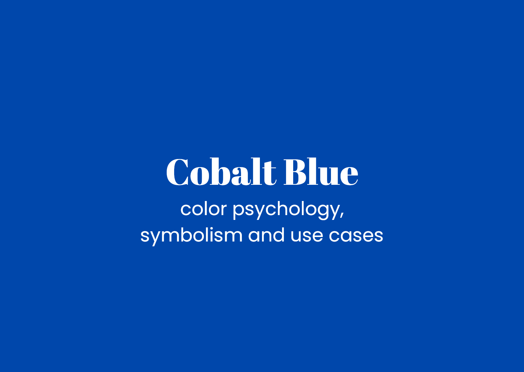
Cobalt blue is a bold and vibrant color that instantly captures attention with its deep, rich tone. Loved across cultures and industries, it brings energy, trust, and sophistication to any design.
In this article, I’ll guide you through cobalt blue’s fascinating hues and palettes, psychological impact, and practical applications to help you make the most of this striking shade.
Cobalt Blue Hex Codes and Color Variations
The standard hex code for cobalt blue is #0047AB. It sits between royal blue and navy but stands out for its brightness and depth.
You’ll find cobalt blue variations leaning toward brighter, more electric blues or slightly muted, softer shades for subtlety. Building palettes with cobalt involves balancing it with neutral grays, crisp whites, or complementary oranges to create harmony and contrast.
Cobalt Blue Color Meaning and Symbolism
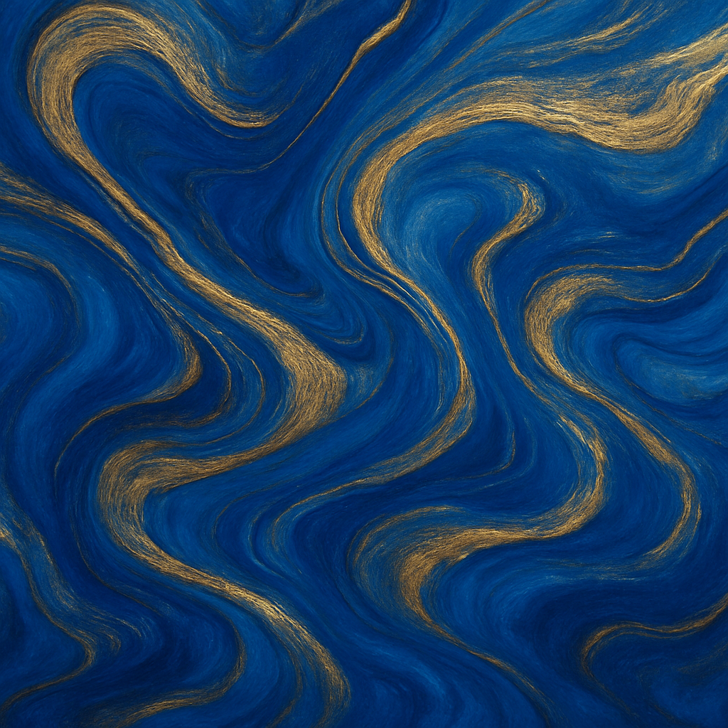
Cobalt blue carries a rich legacy dating back centuries when it was prized for its vibrant pigment made from cobalt salts.
 Cobalt Blue Oil Paint Texture
It’s historically associated with royalty, wisdom, and tranquility. Various cultures have used cobalt blue in ceramics, paintings, and textiles, symbolizing depth, stability, and inspiration.
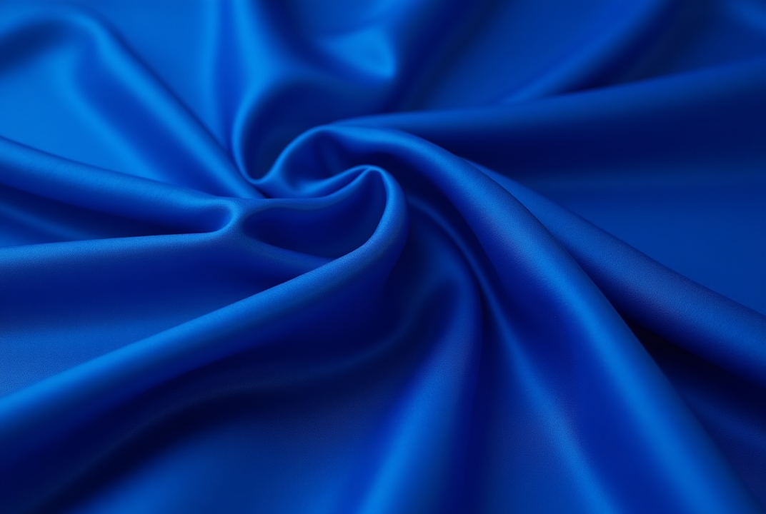 Cobalt Blue in Silk Textures.png
Emotionally, cobalt blue represents confidence, calmness, and creativity. It balances energy with serenity, making it a powerful color for brands and art that want to inspire trust while energizing audiences. In spiritual contexts, it often denotes clarity, insight, and spiritual awakening.
Color Psychology of Cobalt Blue
Research shows blue hues, especially cobalt, evoke feelings of calm and reliability but with a creative spark.
It’s widely used in wellness, tech, and educational settings to promote focus and trust. Cobalt blue’s vibrancy also stimulates motivation and open-minded thinking without overwhelming the senses.
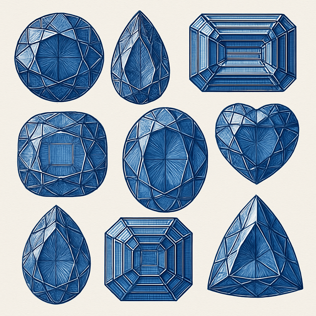 Saba_Sohail_cobalt_blue_jewels_910deac3-ba98-4935-b78f-454dca753e5c.png
Many creatives choose cobalt blue to boost innovation and communication.
It’s a color that invites confidence and clarity, helping viewers feel grounded yet energized—perfect for brands and environments focused on growth and intellect.
Color Accessibility and Conversion
When designing with cobalt blue, accessibility is key to ensure all users have a good experience. Here are some pointers:
-
Contrast: Pair cobalt blue with light text colors like white or pale gray for maximum readability. Avoid low contrast combinations that strain the eyes.
-
Color blindness: Cobalt blue is generally distinguishable for most types of color blindness, but always test with tools to confirm.
-
Conversions: In print, cobalt blue is often matched with Pantone 2728 C or similar shades. It converts well between RGB, CMYK, and HEX, but calibration ensures consistent vibrancy.
 Cobalt Blue Monochromatic.jpg
How Cobalt Blue Looks on Different Screens
Cobalt blue can shift slightly depending on screen types and lighting. Here’s what to expect:
- OLED vs LCD: OLED screens tend to display cobalt blue with deeper saturation and richer contrast, while LCDs may render it a little softer.
- Ambient lighting: Natural daylight enhances cobalt’s brightness, but artificial lighting may dull it.
- Calibration: Use design software previews and calibration tools to ensure cobalt blue maintains its true intensity across devices.
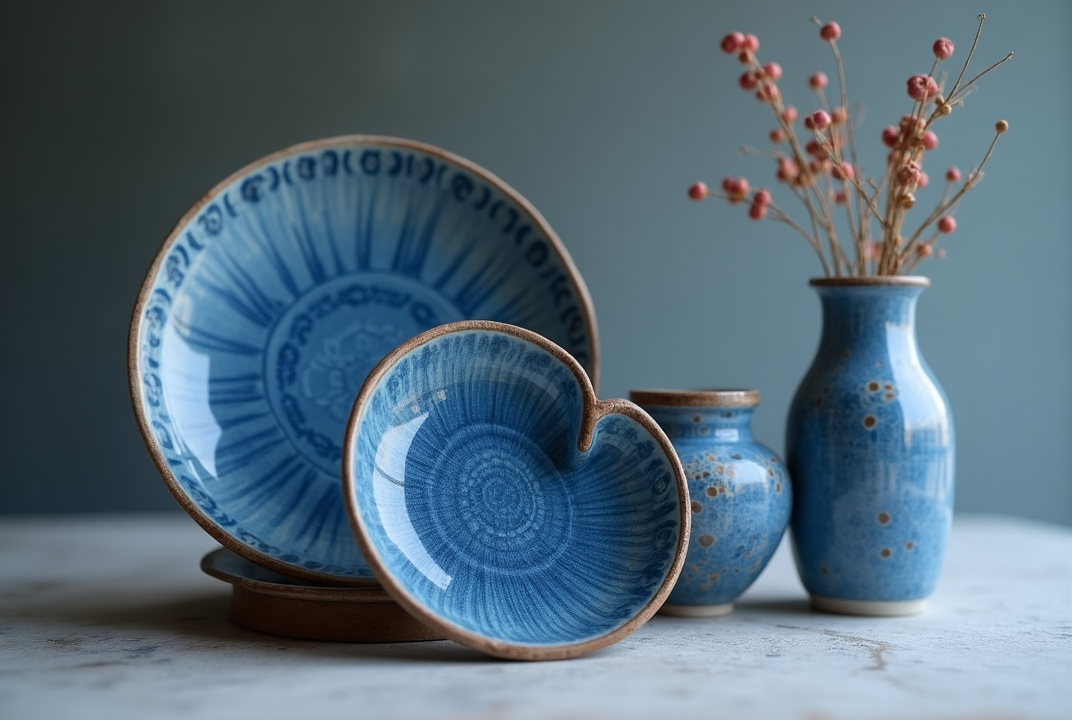
 Cobalt Blue Ceramics
Use Cases of Cobalt Blue in Design
Use in Print Media
Cobalt blue’s vibrancy can really pop on print materials, but it comes with some considerations.
- It works beautifully on high-quality, coated papers where the pigment can shine without looking flat.
- Matte papers offer a more subdued elegance, making cobalt feel sophisticated rather than overwhelming.
It’s a go-to choice for luxury packaging, magazine covers, and promotional materials that want to grab attention and convey trustworthiness.
Color Matching and Printing Tips
Cobalt blue is rich and saturated, which makes it stunning in print — but also a little tricky. It requires proper color calibration between digital and CMYK print files.
If you want to stay true to the vibrancy of #0047AB, it’s worth using Pantone 2935 C or a spot color to maintain visual consistency across packaging, posters, and flyers.
Paper Types and Finishes
If you’re using cobalt for large printed visuals — like event signage or magazine ads — go with satin or matte finishes.
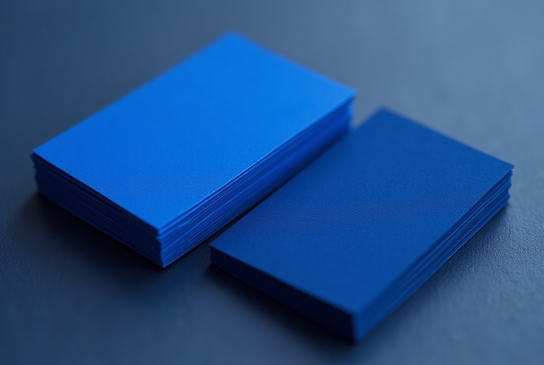 Cobalt Blue in Business Cards.png
Want these cobalt blue business cards for your brand?
Gloss can sometimes distort the deep tone, making it too shiny or reflective. For business cards or invitations, pair cobalt ink with soft-touch paper or letterpress finishes in gold foil for premium appeal.
High-Impact Use Cases
- Invitation cards with white/silver text overlays
- Restaurant menus with cobalt accents for a modern yet calming aesthetic
- Hardcover book covers for genres like thriller, self-help, or leadership
- Luxe thank-you notes, brand inserts, or packaging wrap sheets for boutique eCommerce brands
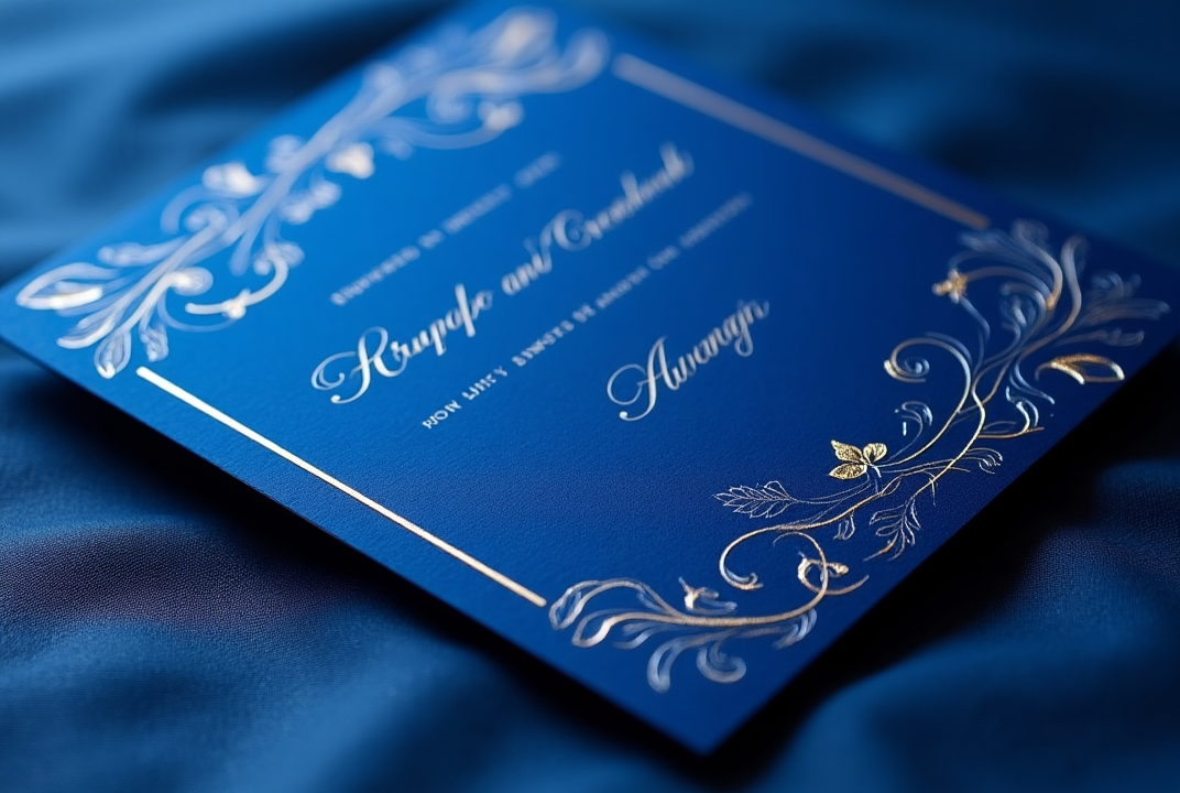 Cobalt Blue in Invitation Cards.png
Use in Digital Media
Cobalt blue shines on digital platforms, making interfaces feel modern and confident.
Studies show cobalt blue can improve focus and create a calming yet motivating environment, boosting time on site and conversion rates.
Here’s how it plays out:
- Cobalt Blue in Backgrounds for Video Thumbnails
Need scroll-stopping thumbnails for YouTube or Instagram Reels? Cobalt works brilliantly.
It contrasts well with white and yellow fonts, making your titles pop.
Whether you’re creating tech explainers, travel vlogs, or tutorials, a solid cobalt background paired with expressive imagery is a recipe for high CTRs.
Bonus tip: Add golden or neon pink accents in borders or emoji overlays to make your thumbnail even more eye-catching.
- Website and App Design
Use cobalt as a primary or accent color in navigation bars, buttons, or hero sections. It draws attention without being aggressive.
 Cobalt Blue in Website Design
Cobalt backgrounds with white text are highly readable — perfect for modern SaaS landing pages or eLearning platforms.
You’ll also find cobalt effective in dark mode interfaces, where its depth stands out more than flat black or gray tones.
- Professional Headshots
Cobalt blue makes an incredible digital background for professional headshots. It complements a wide range of skin tones and gives a clean, sophisticated impression.
 Headshot Background: Cobalt Blue
If you're designing your own AI-generated headshot in ImagineArt’s AI image generator, use a prompt like:
“Professional portrait with cobalt blue studio backdrop, soft lighting, business casual outfit.”
This color works especially well for corporate or consultant profiles, resume headshots, or social avatars that need to project trust and sharpness.
Use Cases in Logo Design
Cobalt blue delivers emotional weight and modernity, perfect for brands wanting to balance trust and innovation.
- Tech startup “BlueNova” uses cobalt in its logo paired with sleek sans-serif typography. The cobalt signals trust and forward-thinking.
- Financial advisory firm “Cobalt Wealth” opts for cobalt blue with a classic serif font and an abstract shield icon, communicating reliability and security.
![]() Cobalt Blue Logo.png
Cobalt Blue Logo.png
Want to create a cobalt blue logo for your startup? Use AI logo generator with this prompt:
“Logo for tech startup with cobalt blue color scheme, modern sans-serif font, abstract star icon, clean and minimalist style.”
Use Cases in Brand Identity
Brands leverage cobalt blue across social media, packaging, and signage to establish a strong, recognizable presence.
It works well for seasonal campaigns, especially winter and tech product launches, where the color’s cool tone supports themes of innovation and freshness.
Product Packaging and Design
Cobalt blue instantly conveys elegance and authority when used in physical products. Think of high-end skincare bottles, luxury perfume boxes, and watches — cobalt gives them a sense of premium quality.
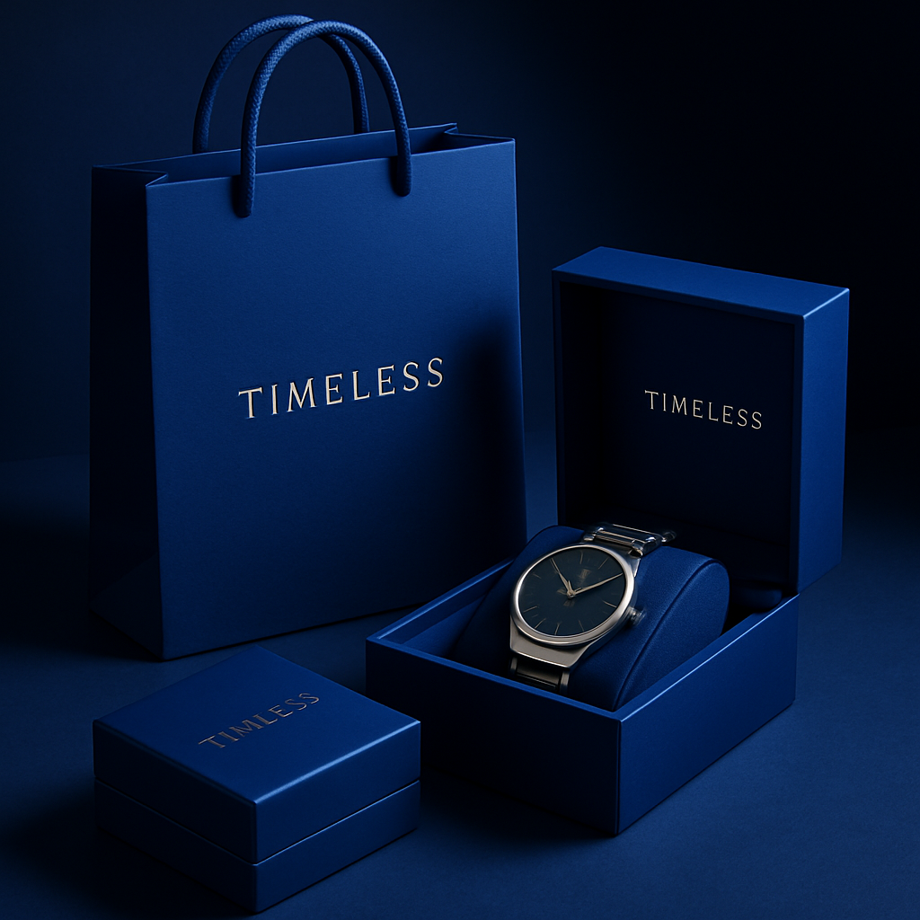 Cobalt Blue Product Packaging
It's a color that tells your customer, "This is refined, this is trusted." For eco-conscious brands, combining cobalt with off-white or kraft paper textures adds a modern yet grounded touch.
Uniforms and In-Store Design
Brands with physical locations often overlook how impactful color can be in uniforms and interiors.
A retail space or coffee bar with cobalt accents — whether in uniforms, signage, or even tile work — feels polished and organized. It’s a powerful way to signal consistency, especially in franchise or boutique environments.
Business Cards and Stationery
Even in the digital age, printed assets matter. Business cards with cobalt backgrounds and white or silver typography stand out beautifully.
The boldness of the color makes a strong first impression while still feeling clean and intentional.
Fun Facts and History
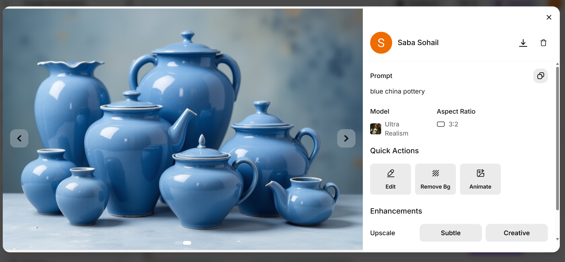
Did you know cobalt blue pigment was discovered in the 18th century but has roots dating back to ancient Persia and China?
 Cobalt Blue China Pottery
The vibrant blue was traditionally made by roasting cobalt salts with alumina, a process prized for its brilliant and lasting color.
It became popular in porcelain and glassmaking, symbolizing nobility and artistic mastery. Over time, cobalt blue came to represent calm authority and creative energy, making it a favorite among artists and designers alike.
Famous Brands Using Cobalt Blue
Several major brands use cobalt blue to great effect:
- IBM is famously known as the “Big Blue,” using cobalt to convey reliability and tech leadership.
- Ford Motor Company uses cobalt blue in its iconic oval logo, signaling strength and trustworthiness.
- **Pepsi incorporates cobalt tones in its refreshed branding, balancing vibrancy and brand heritage.
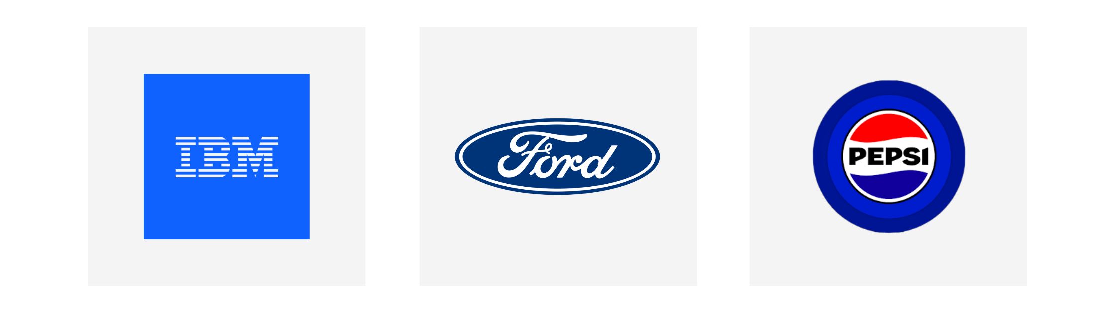 Brands using cobalt blue in their logos
These brands illustrate how cobalt blue creates emotional resonance while remaining fresh and dynamic.
Related Colors and Palettes
Mixing cobalt blue with these palettes can transform your designs, from corporate elegance to playful vibrancy.
Here are five cobalt-inspired palettes to spark your creativity:
1. Classic Contrast
- Cobalt Blue: #0047AB
- Crisp White: #FFFFFF
- Light Gray: #D3D3D3
- Warm Charcoal: #333333
- Soft Coral: #FF6F61
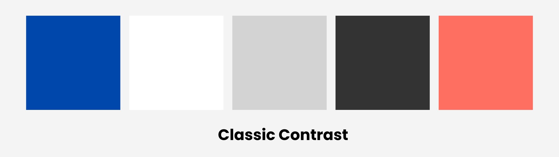 Cobalt Blue Palette 1
2. Ocean Breeze
- Cobalt Blue: #0047AB
- Aqua Teal: #4CB7A5
- Sand Beige: #D9CAB3
- Seafoam Green: #A3D2CA
- Pale Sky Blue: #BFD7EA
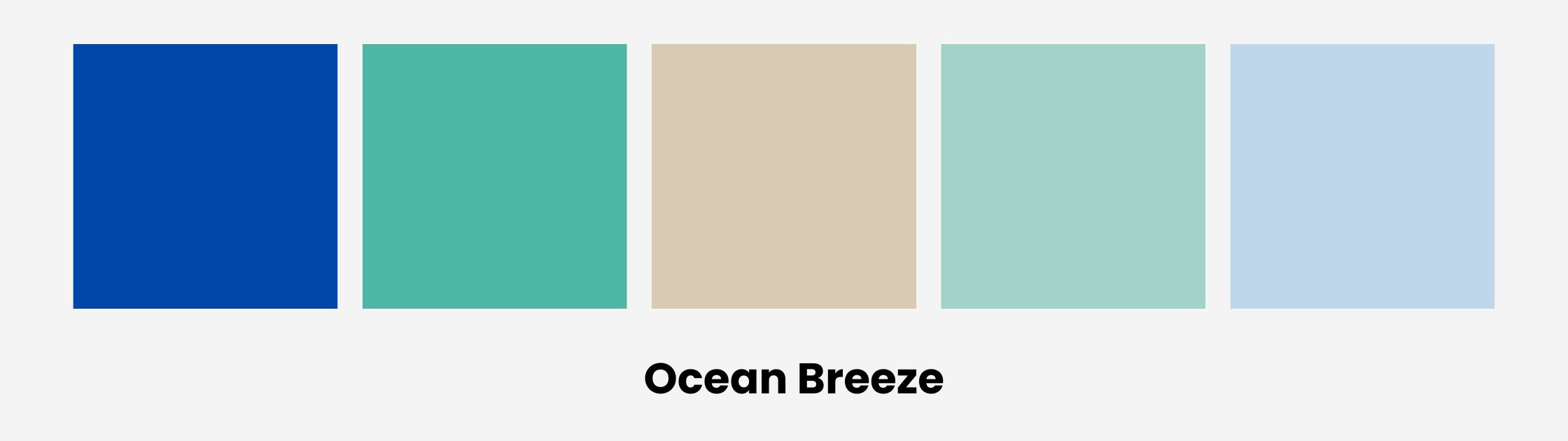 Cobalt Blue Palette 2
3. Modern Minimal
- Cobalt Blue: #0047AB
- Slate Gray: #708090
- Cool Silver: #C0C0C0
- Soft Black: #1C1C1C
- Muted Taupe: #918C83
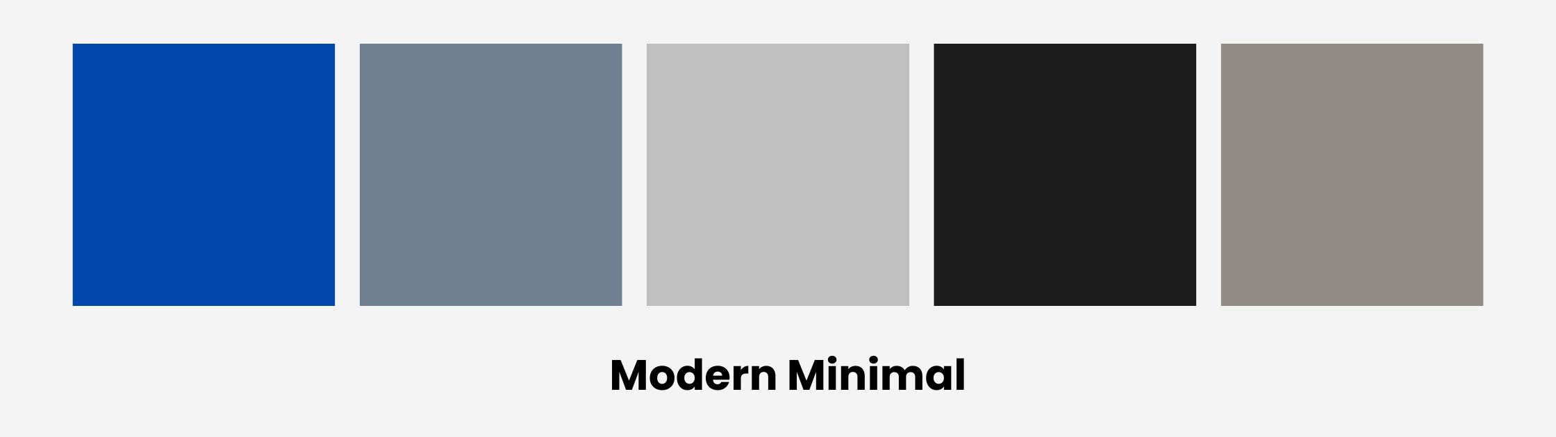 Cobalt Blue Palette 3
4. Warm Balance
- Cobalt Blue: #0047AB
- Burnt Orange: #D35400
- Cream: #FFFDD0
- Olive Green: #556B2F
- Goldenrod: #DAA520
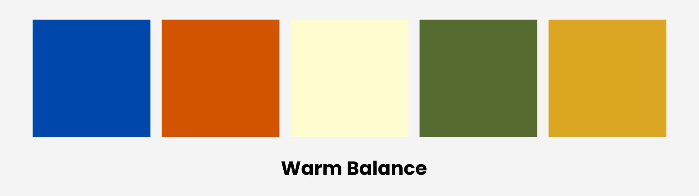 Cobalt Blue Palette 4
5. Electric Pop
- Cobalt Blue: #0047AB
- Neon Pink: #FF6EC7
- Bright Yellow: #FFEA00
- Black: #000000
- Pure White: #FFFFFF
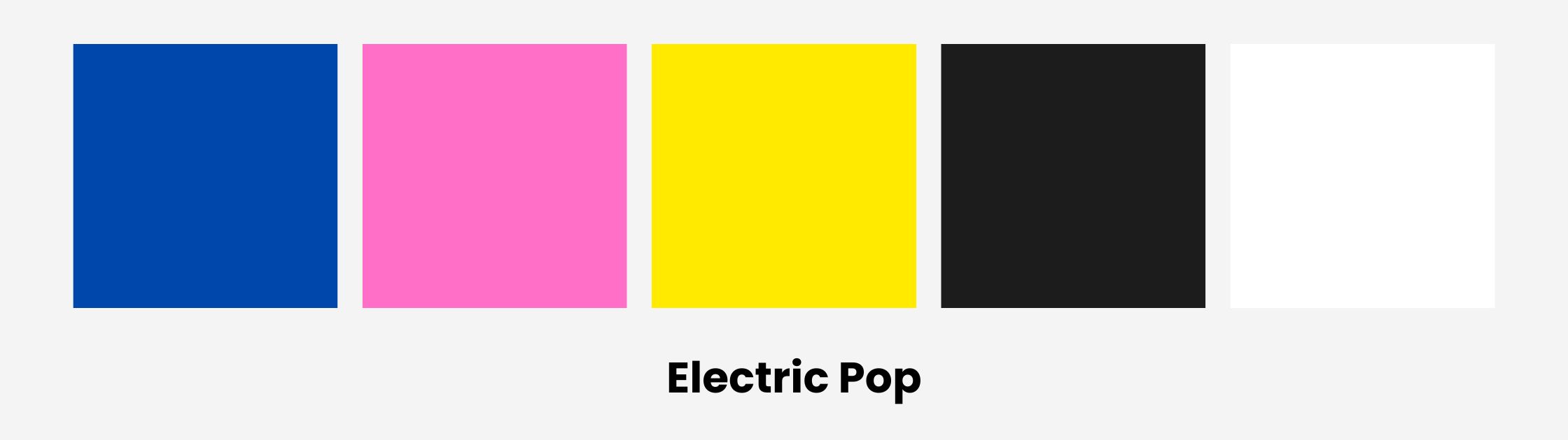 Cobalt Blue Palette 5
Start designing cobalt blue visuals with ImagineArt - complete AI creative suite with dedicated studios for images, videos, shorts, music and speech!
Saba Sohail
Saba Sohail is a content marketing strategist specializing in automation, product research and user acquisition. She strongly focuses on Gen-AI-led speed and scale for creators, professionals and businesses. At ImagineArt, she develops use cases of AI Creative Suite.